
As the sole designer on this project, I worked closely with engineering and ran all the user testing to ensure an efficient and fast-paced product cycle.
CV-Library (CVL), is a leading job search platform, that has seen significant traction through its app, driving an average of 290K job applications and 5.7K new registrations monthly.
Despite its potential, the app is hindered by an outdated infrastructure.
The Resemue Library platform was chosen to be re-designed, built and launched to facilitate learning and best practices for the CVL rollout in late 2025.

Revenue Impact
The RL app contributes 14% of total job applications and 4% of total registrations. However, web app users generate 10x more applications, presenting a substantial opportunity for revenue growth by improving user engagement and retention.
User Pain Points
Outdated infrastructure causing performance issues.
Lack of personalised engagement, such as push notifications or tailored job suggestions.
Limited features for proactive job seeking, e.g., incomplete applications or saved job reminders.
Cost of Problems
Lost opportunities to increase job applications and registrations.
Higher user drop-off rates, affecting revenue from job postings.
Increased support requests for incomplete or stalled applications.

Strategic Approach
I facilitated user research and internal audits. These revealed:
A significant gap in engagement due to a lack of proactive communication.
Demand for modern features like preferences, in-app notifications, and better job tracking.
Opportunities to leverage M3 (Material Design 3) for scalable and adaptive design solutions.
Solution Framework
Key pillars of the rebuild:
A card-based, modular UI/UX leveraging M3 for scalability across iOS and Android.
Utilising the M3 framework ensured a DS that was familiar to most users whilst still giving us infinite flexibility on design
Simplified navigation with toolbars and tabs for clear, intuitive access to key features.
Proactive engagement mechanisms, including push notifications, reminders, and actionable tiles.
Decision Criteria
Address infrastructure shortcomings with a scalable, modern tech stack.
Integrate my tried and tested UX principles to enhance usability and reduce user churn.
Align features with user needs and job-seeking goals, validated through iterative testing.
Implementation Plan
Platform Choice: Selected a hybrid development approach using M3 components for unified design across platforms via React Native.
Feature Development: Prioritised user-driven functionalities like push notifications, preference centres, and real-time job activity tracking.
Design Process: Conducted research-driven iterations with prototypes tested against existing pain points.
Timeline: Phased development, with a full rebuild targeted for Summer 2024 and release by March 2025.
Measurable Results
Projected Impact
User Engagement: Expected to increase job applications and registrations by leveraging user-first design and personalised features.
Retention Rates: Enhanced with timely, actionable reminders and a seamless user experience.
Operational Efficiency: Reduced support inquiries through clear and transparent job tracking.
Performance Metrics
Anticipated 20% increase in app-driven applications and registrations post-rebuild.
Reduced user churn by simplifying onboarding and preference setting.
Increased app store ratings due to improved performance and design.
Qualitative Feedback
Early prototype testing demonstrated:
The positive reception of the tab-accordion hybrid design for job activity tracking.
User enthusiasm for proactive engagement tools like reminders and action prompts.

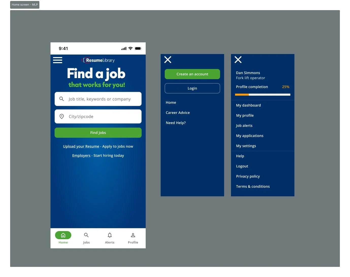
Visual Evolution
Before
Static, outdated interface with minimal personalisation.
Limited feedback mechanisms, resulting in user frustration.
Key Iterations
Initial Concepts: Calendar-based designs; cluttered and lacked clarity.
Refined Approach: Tile-based prompts and notification badges for actionable insights.
Final Design: M3-driven, modular design with dynamic updates and intuitive navigation.
After
A modern, card-based layout with real-time updates and a preference centre.
Seamless push notification opt-ins and reminders for incomplete or saved jobs.
A dedicated tab for job activity, featuring glanceable and detailed application statuses.

Why This Works
Addresses Business Goals
By enhancing user experience and driving engagement, the app maximises its role as a job application channel.
Demonstrates Strategic Thinking
The rebuild is rooted in user research and data-driven decisions, ensuring alignment with both user needs and business objectives.
Proves Impact
Prototypes validated improved user satisfaction and trust, while projected metrics indicate significant revenue and engagement growth.
Justifies Investment
The scalable, adaptive design prepares the app for future growth while enhancing current performance.
Implementation Steps
Audit Existing Infrastructure: Identify bottlenecks and prioritise features for rebuilding.
Research & Ideation: Conducted user interviews and usability testing to refine the design.
Iterative Prototyping: Developed, tested, and refined designs using M3’s modular components that had been adjusted to suit our design guidelines.
Development & Testing: Collaborate with engineering to deliver a robust, scalable app.
Launch & Monitor: Roll out in March 2025, followed by metric-driven optimisations.