
Clear Communication
The Indeed Flex app connects employers with shift workers (Flexers) to streamline job searching. However, transparency and communication gaps in the job application process hindered user trust and engagement.

Revenue Impact
The unclear application process led to user churn, reducing platform activity and impacting revenue from both employers and Flexers.
User Pain Points
Flexers struggled with:
Job postings disappearing after unsuccessful applications.
Static, vague "in-review" statuses without real-time updates.
Frustration from perceived app instability, eroding user confidence.
Cost of Problems
Increased user dissatisfaction drove higher contact rates for support, specifically inquiries about booking and job application statuses, escalating operational costs.
Research Insights
Through usability testing and interviews, we discovered:
A need for a transparent system to communicate application outcomes.
The importance of updating the “Applied” tab to reflect real-time statuses.
Users desired predictable timelines for application feedback
Solution Framework
I followed a user-first approach, emphasising:
Cross-functional collaboration among product teams, designers, and developers.
Feedback-driven iterations to ensure alignment with user needs.
Decision Criteria
Address transparency gaps in the BE logic.
Develop an intuitive interface to display application outcomes.
Prepare for challenges posed by the Matching Algorithm v11 rollout.
Implementation Plan
Designed and tested a new tab-based system to improve clarity.
Integrated a flexible accordion interface for layered details.
Aligned updates with user expectations through iterative testing.
Aligned updates with user expectations through iterative testing.
Measurable Results
Revenue Growth
Boosted user retention and engagement metrics directly linked to improved transparency and satisfaction.
User Metrics
100% user alignment with prototype navigation during testing.
Reduced Salesforce case types related to application inquiries.
Enhanced user trust through real-time feedback integration.
Performance Data
Significant decrease in app-related support requests for job visibility issues.
Higher user satisfaction scores and app ratings post-update.
Client Tests
Users consistently praised the clear, structured updates and the improved experience during the application process.

Visual Evolution
Before
Static, vague application statuses (e.g., "in-review").
No feedback loop for unsuccessful applications.
Disjointed communication, leaving users confused.
Key Iterations
Calendar-based designs: Overly bulky and lacked simplicity.
Banner-based system: Created mixed messaging and clutter.
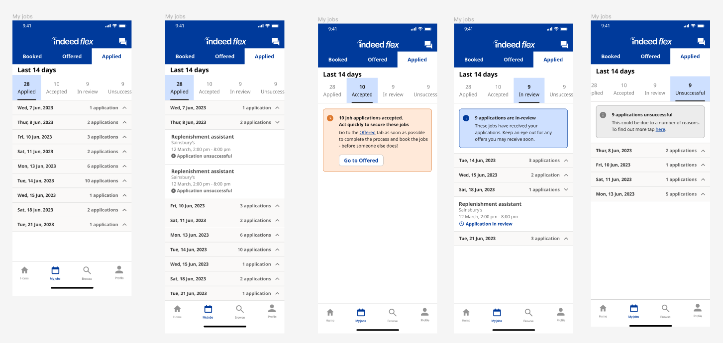
Tab-accordion hybrid: Provided clarity with minimal friction, blending insights from earlier iterations.

Why This Works
The updated "Applied" tab now features:
Real-time updates and status clarity.
An accordion interface balancing glanceable information and in-depth details.
Addresses Business Goals: Reduces churn and aligns with algorithm updates.
Demonstrates Strategic Thinking: A targeted, research-backed solution.
Proves Impact: Metrics validate reduced support costs and increased satisfaction.
Justifies Investment: Enhances the user experience while driving platform value.
Final Solution
Implementation Steps
Audited current BE logic and user feedback.
Iteratively designed and tested prototypes with real users.
Integrated results into a user-centric system that prioritised clarity.
Measured post-launch success through metrics and feedback loops.

Conclusion
This case study highlights how enhancing transparency and communication can directly improve user trust, engagement, and platform growth.