
The Job Application Experience
Problem:
In this case study, we're addressing challenges faced by the users of our app and their understanding of how a job application is progressing. Working to make the application process clearer and more user-friendly.
Goals:
Reduce the churn rate.
Introduction
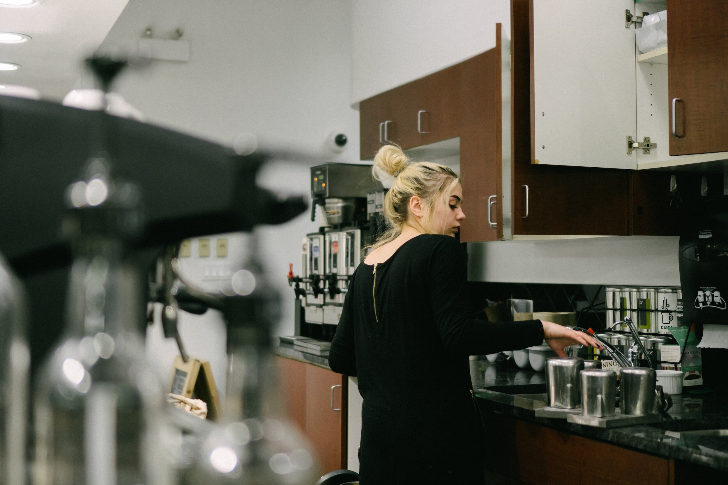
The Indeed Flex app revolutionises job searching, instantly connecting employers with shift workers. This case study delves into our mission to enhance transparency and communication for shift worker or Flexers, as we call them.
Background
Flexers encounter frustration with a lack of real-time updates on job applications. Once applied and if unsuccessful in that application - the job just disappears. The app looks broken.
The existing BE logic, coupled with an upcoming algorithm rollout, prompted us to redesign a user-centric solution to elevate overall satisfaction.
Objectives
Address transparency and clarity issues in the BE logic
Enhance the "Applied" tab to accurately reflect application statuses
Mitigate the impact of Matching Algorithm v11 on lower-value Flexers.
Approach
Collaborative efforts among product teams, UX/UI designers, and developers are guided by user-centric principles and iterative feedback loops.
Key Measures
Reduction in contact ratio for "how to book" and Salesforce (SF) case types.
Reduction in SF case types regarding application visibility and disappearing shifts.
Design Exploration:
Users have persistently expressed concerns regarding the lack of transparency and effective communication surrounding the status of their job applications.
The pre-existing application logic failed to provide users with the essential visibility required to understand the outcome of their applications.
In particular, the “Applied” tab perpetually displays a generic “in-review” status, contributing to user frustration and dissatisfaction.

During our journey, we explored various design options.
Initially, a calendar-based system was considered, but it proved too bulky, hindering the seamless user experience I aim for.
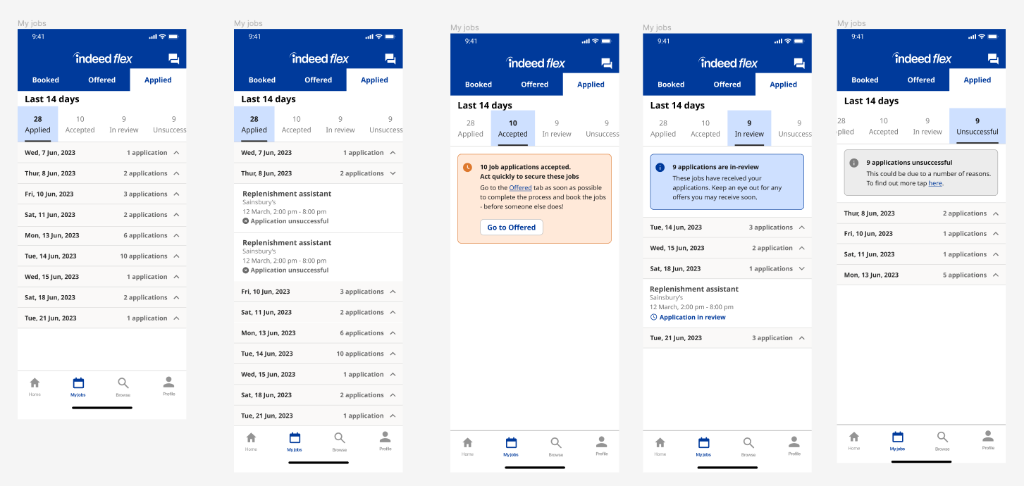
Subsequently, a banner-based system was experimented with; however, it proved clunky, displayed mixed messaging, and led to confusion.

After these iterations, we found success in combining elements from both approaches. The resulting tab-based system allows users to view information at a glance, providing clarity, while also offering the flexibility to delve deeper when needed.

User Testing
Methodology
Conducted 1-1 interviews and usability testing
Explored participants' job application and update-checking processes
Gathered feedback on the prototype
Findings
Users navigated the prototype seamlessly, with no pain points
2 users suggested adding a timeframe for hearing back from employers during the application review
Achieved 100% alignment with users' mental models, an unprecedented result
Conclusion
This case study showcases my commitment to empower Flexers through clarity, transparency, and an intuitive user experience amid the evolving algorithm rollout. The successful integration of design elements into an accordion based system reflects our dedication to refining the user journey.